
When choosing stocks to buy, a helpful skill to refine is following and deciphering chart patterns in the stock market. Learning to read chart patterns translates to identifying imbalances in the founding principle of the stock market, supply and demand. Research shows prices tend to move in the same direction as market trends after studying hundreds of years’ worth of pricing charts. When these factors shift, they stand as indicators to the observant investor to buy, hold, or sell stocks. Many believe this form of technical analysis may accurately predict stock performance.
This guide will illustrate the most common chart patterns and how investors choosing stocks to watch would read these patterns.
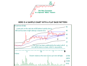
One of the common stock patterns observed when seeking stocks to buy is known as the “flat base” and looks like what it sounds like – a rough plateau.
The flat base moves horizontally over a period of time, give or take nominal rises and drops; the pattern indicates volume is decreasing. To verify what you see, sketch a trend line across the mildly jagged edge of the flat base. Once the stock starts to rise above this trend line, one may deduce more shares are purchased and volume is back on the rise.
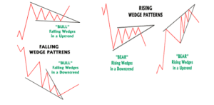
Another common stock pattern to identify before buying stocks is referred to as “the wedge” pattern.
This formation occurs when converging trend lines meet at an apex similar to triangular patterns (more on those triangle patterns in the next three sections). What makes a wedge pattern distinct is an obvious diagonal slant either reaching up or down. Volume is diminishing as the pattern emerges and increasing as the shape closes. A descending wedge pattern is considered bullish while a rising wedge generally indicates a bearish downtrend.
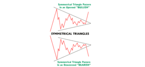
Similar to the wedge pattern are three variations on triangles: Here’s how to identify a symmetrical triangle when picking stocks to watch.
A symmetrical triangle pattern indicates uncertainty in the market. Often this pattern implies supply and demand have evened out. The precedent for this chart pattern frequently resolves in tandem with the upcoming trend. One could strongly consider stocks continuing to move in this pattern as ready to trade. Volume characteristically starts out low as this chart pattern emerges, resembling a sideways triangle. The uncertainty of the market tends to result in a heavy volume state.
The ascending triangle often indicates a volume increase in stocks to watch.

The third triangular chart pattern, the descending pattern, tends to indicate bearish trends when assessing stocks to watch.
This pattern is identified as having a flat bottom with the top line moving in a downward slant. One may witness prices dropping so much the shares are oversold where more tentative investors are buying stocks. The associated higher price arising with the oncoming new purchases attracts sellers who inevitably control and influence the lows demonstrated in this pattern. Like the previous two triangle formations, volume is typically shrinking and will swell again upon the resolve.

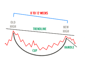
Moving away from angles, the first curve in chart patterns to identify when buying stocks is the “cup and handle” pattern.
This distinct pattern signifies a market correction following a strong advance over a 2 to 4 month period. Investors start to sell off the stock at approximately 20% – 35% of the previous high. Selling pressure is built by investors who bought shares closer to the old high and may cause the price to sink in a drifting, side-to-side motion anywhere from 4 days to 3 weeks. This activity is what creates the “cup” shape; the “handle” is made with a 5% drop. If the handle sinks much lower than 5%, it is considered failing and extremely high risk for investors seeking stocks to buy. Instead, wait to see if this pattern ascends from the bottom of the “handle” shape over the old high observed at the end of the 2 to 4 month time frame. Some speculate the grandest success stories emerge from witnessing this particular chart pattern.
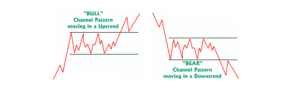
Investors seeking stocks to buy can bet chart patterns moving in channels are characteristic of a balanced supply and demand period.
The trend lines in this pattern often move parallel in a rectangle formation. The number of buyers and sellers are mostly even and the same highs and lows are consistently tested. The activity level decreases during this phase and volume tends to increase at the breakout point.
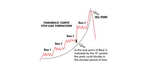
If the lines of the channel are rising upward, investors researching stocks to watch may obverse what is known as the parabolic curve pattern.
This pattern is what every investor wants to see; the upward curve of this pattern indicates a big, fast ROI. This curve tends to emerge with the closing of a notable market advance and is formed as the result of multiple base formation departures.
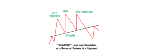
While investors seek stocks to buy, a reliable pattern on the uptrend is the “head and shoulders” pattern.
Most see this formation as a noticeable reversal within an uptrend. As the market hits the brakes, supply and demand generally balance out again. Those wanting to sell their shares arrive during the highs which, in turn, means buyers are swarming and force the stock to a brand new high. That new high tends to suffer a quick retreat in this particular pattern (creating the “neckline,” so to speak). When buyers cautiously reemerge, the next high tends to fall short of the previous high. The “shoulder” aspect of this pattern emerges as the buyers lose interest and the markets tests the downside once more. Volume tends to increase at the breakout point.
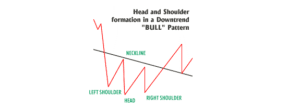
Sometimes the “head and shoulders” pattern is inverted and becomes apparent during downtrends as investors seek stocks to buy.
The far left “shoulder” indicates a rise in volume whereas the creation of the downward facing “head” demonstrates less volume. As the edge of the “head” reaches towards the “shoulder,” volume has, likewise, risen. As the opposite “shoulder” forms, volume is at its lightest, at which point, buyers may have run out of interest.
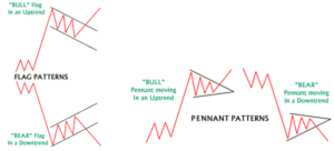
Lastly, investors buying stocks will periodically observe relatively reliable patterns known as “pennants” and “flags.”
Identifying these smaller patterns can lead to the assumption of a continuation pattern with short pauses within active stocks. They are most often spotted after a grand, fast move in the market and the stock generally moves in the same direction whether bullish or bearish. Unlike the wedge, bullish and bearish “flag” lines run parallel. Pennants are similar to symmetrical triangles save for the fact they are much smaller. Volume has the tendency to contract during the market pause and increases at the resolve.


")


